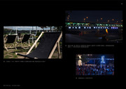
We have created the identification of RWE summer activities announcing its upcoming rebranding into innogy.
Strategy
In relaction to the change of RWE into Innogy, we were asked to prepare a temporary branding aimed at bringing the RWE world closer to the world of illustration of the new brand. Branding, which will quickly disappear, but before it does, it has to immediately attract attention.
Design
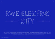
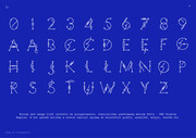
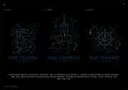
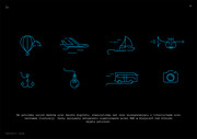
RWE Electric City is an identification project inspired by the basic product of both brands - electricity. The project, which in both lettering and other elements of branding, at the same time was associated with RWE, and on the other hand subconsciously familiarized the user with the upcoming changes.
Creation
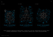
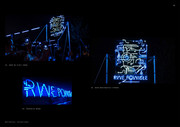
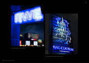
The nature of illustration and lettering fits perfectly into the urban space where it was used. RWE funded three neons that were placed in locations close to the brand in the city center, in Powiśle and on the Vistula boulevards. We have also created a page that allows individual texts to be written with our font.
